Stakeholder Roadshows and Process Changes for Customer Experience - Part 2
Continue solving customer problems by all means necessary - stakeholder management, roadshows, and process changes. Also, a dashboard! Part 2 in understanding customer behavior.
In part 1 of this article, we started our retrospective journey of understanding customer behavior that eventually helped halve the normalized number of support questions raised by customers for my business unit’s (BU’s) product suite. We used an anecdotal scenario from my experience as a Product Manager in dealing with an opaque customer support ticketing system. We realized the main problem was the vague categorization of support tickets, which led us to create a new taxonomy of category tags.
In this article, we will be looking at how to deal with another set of 10,000 support tickets that were never analyzed or responded to. We will also look at how to notify support ticket users - remember the different stakeholders we’d identified? - across all geographies and departments about the new taxonomy of ticket category tags. After that, we will build a dashboard by using the base principles discussed in the last article.
These topics highlight the need for PMs to have cross-functional leadership, have data visibility to make data-informed decisions, and persuade teams towards their vision. I hope the retrospective helps you gain new perspectives to visualize customer experience metrics and align stakeholders for making process changes.
If you have expertise in these topics and feel like skipping to the next part - don’t forget to subscribe, if you haven’t already, so that you do not miss the next parts of the article.
Thumbnail credits to Business vector created by pch and Food vector created by upklyak.
Streamlining Support Channels
One of the ways our product interacted with customers was by sending customers a monthly report of their usage via email. Out of our 100,000 customers, this email went to about 10,000 large enterprise customers. This email suggested that customers reply to the email with any questions on the report - which provided an easy and convenient way for customers to send across a question. This channel had exploded in use due to its convenience to customers and lack of email filtering. The result of this email and the email instruction was:
1,000s of auto-replies each month
1,000s of questions ranging from questions on the monthly reports to any topic from the rest of the company’s products
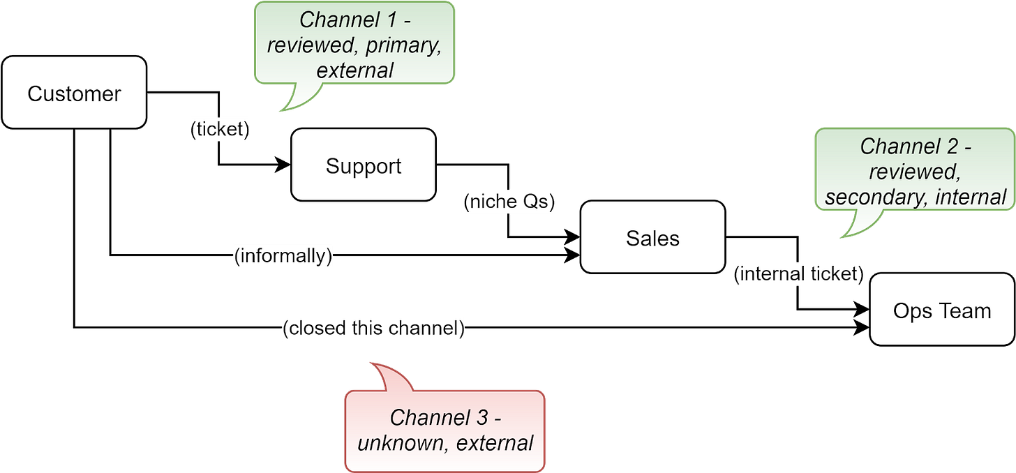
You might remember the Ops (operations team) team from part 1 that handles escalations from the support team. For ease of understanding, you can see the diagram below.
These email responses from customers hit an inbox of the Ops team without any filtering and a team not built to handle this volume of queries from customers. When this burdened Ops team faced
Channel 3 - one source of infinite queries, the majority of which were noise and
Channel 2 - another source of finite structured queries,
they focused on the latter. Customers did not receive replies to their questions on support channel 3. This led to dissatisfaction amongst large enterprise customers who leveraged this (seemingly) very convenient approach to submit support questions but never got a response.
At the time of our analysis, the inbox had accumulated over 10,000 unread questions over the last 3 months. To understand the channel, we tried following a similar approach to the analysis of 1,000 tickets. If we could figure out how similar were the questions in this channel vs what we’ve already reviewed, then we needn’t analyze 10,000 tickets but only a sample of those that prove the hypothesis that they are similar in nature and frequency of questions. I worked with the team specializing in maintaining support tooling on this. We built some filters to weed out the auto-replies, but we were not able to filter everything. The Ops team was not equipped to handle this volume and be external-facing support. We also ran into a wall analyzing the volume available here since despite filtering we were left with a lot of auto-generated emails sent to the channel by customer systems.
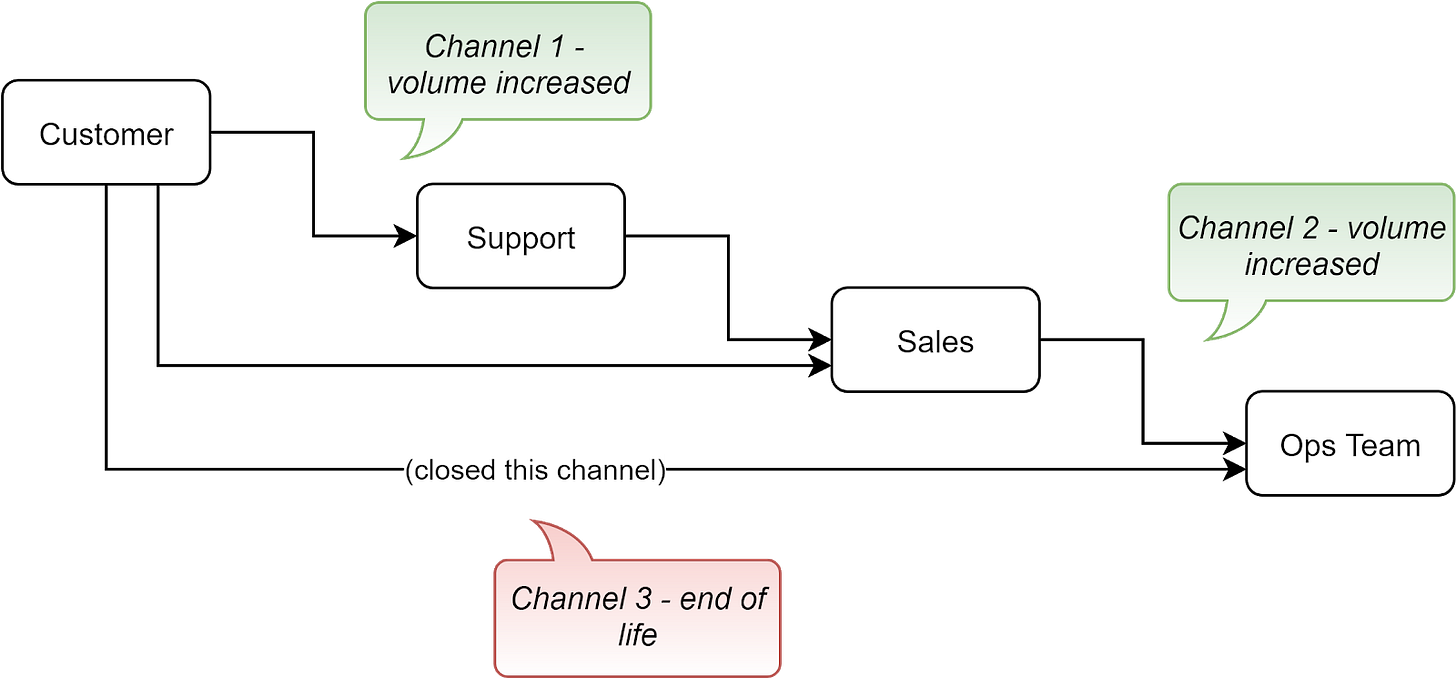
Given the priorities of the team and the unyielding nature of this channel, we decided to start afresh by shutting this down. The support channel was end-of-lifed (EoL). We built auto-replies in this channel as well as changed contact information on outgoing emails from the system to redirect customers to the primary support channel.
This in turn increased volume on other channels.
Examples of software that support agents in your company could use to respond to customer support inquiries and tag tickets are Freshdesk, Zoho Desk, Zendesk, Happyfox, Servicenow, Salesforce, Freshservice, or Agiloft.
Remaining problem — the new taxonomy is implemented into the multiple support tools we use, but how would support requesters and responders across geographies and support channels ramp up on it?
Roadshow to Drive Understanding of New Taxonomy
You might remember from part-1 that support tickets in the old categories were miscategorized or vaguely categorized. Incorrect categorization of tickets meant unreliable metrics - a PM who knew the metrics were unreliable would not need to review 100s of tickets to identify impact metrics for prioritization or a PM who did not know the metrics were unreliable would prioritize the wrong features or build an incomplete solution.
There were four teams that created or solved tickets in the product space of my department. This meant all of them are responsible for correctly tagging a ticket. These agents were across geographies, functions, and support channels. Their team sizes also varied - the number of members in them were 2, 6, 28, and 500, respectively.
To ensure high percentage accuracy in the categorization of tickets, I worked with the support lead to investigate the possibility of hiring a QA/QC (Quality Assurance or Quality Control) team for quality control. The support lead also investigated an alternative of hiring an analyst instead so that it can add further value on top of the data. However, due to budget constraints, the leadership decided to not pursue any of these hirings. We can discuss this possibility in more detail in part-7 (WIP) where we’ll touch upon approaches I wish I’d tried, why, and with expected outcomes.
Many of you might have seen budget constraints play spoilsport in cross-department collaboration. I’m sure you’ve attempted workarounds and relationship-based persuasion as well. I’ll share a similar experience below.
To improve accuracy in the categorization of tickets, explaining and persuading the teams was the primary approach I was left with. Explaining the taxonomy to the teams and, more importantly, persuading them to spend a few extra seconds to tag the most appropriate category for any ticket they create (as a requestor) or resolve (as an agent).
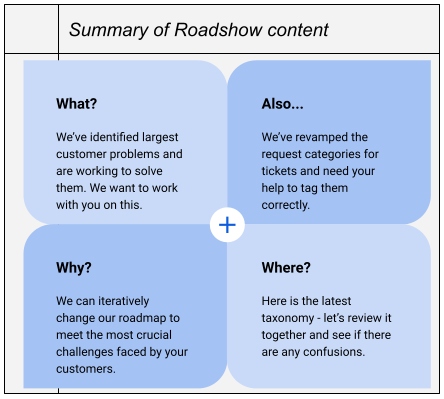
I reached out to the leads of the different teams to set up meetings with the teams to share the new taxonomy and roadmap with them and hear them. This helped increase awareness of the roadmap and increase the likelihood that users would tag their tickets appropriately (or so I thought!). I’ve shared a summary of the roadshow content below, which you can use as an example.
A learning for me from these meetings was that this makes for a great experience for the teams since the teams felt heard and could see that we were aiming to solve their problems or their customers’ problems.
Examples of software you could use to pitch your roadmap and evangelize internal changes are Google Slides, Microsoft Powerpoint, Apple Keynote, LearnUpon, Continu, Highspot, Focusky, Intuilab, Showpad, Mikogo, Presentia, and Prezi.
Problem — now the tickets are being tagged with the new categories. But with about 1,000 tickets filled by customers each month how do we keep track of the trend of issues faced by customers?
Another Problem — We’ve encouraged teams to tag tickets accurately, but how accurate will the data be? Ballpark 1% error, 10% error, or 50% error? We’ll discuss this in a later part (WIP).
Self-updating Dashboard to Analyze Incoming Tickets
To keep track of the trend of issues faced by customers, I looked at building a dashboard and building notifications. My quest to get a dashboard and notifications based on ticket volume faced three challenges.
We had multiple support systems (Channel-1 and Channel-2 from the earlier visual)
We needed to connect the dots between different pieces of information to find a metric that was valuable and
We had multiple audiences for the dashboard and needed a way to meet different needs.
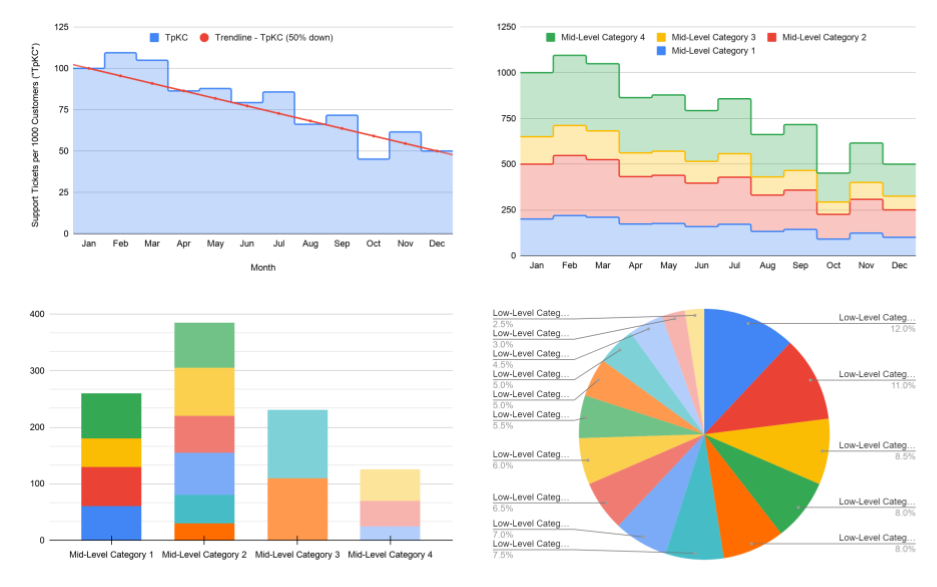
I wrote down the needs to consolidate the complex and divergent needs and put together some prototype dashboards to illustrate the end goal, keeping the three challenges in mind. The audiences we are discussing are similar, although not the same, as the ones we’d discussed in part-1. I addressed the challenge of multiple audiences by organizing the information hierarchy ranging from high-level to in-depth.
The E-team could glance at the high-level information,
R&D leadership could look at more details, and
support specialists and PMs can look at the in-depth portions.
With help from several cross-functional experts from sales operations analytics, support analytics, program management, and business intelligence, transferring all data to SQL databases seemed to be a feasible solution. Once in SQL, we could enable a dashboard on top of it using cloud-based SQL-based dashboards. After iterating on the dashboard and the dashboard tiles with the analysts’ team, the dashboards were ready! With their help, I could also set up email notifications to notify relevant teams about the data on a weekly and monthly basis.
I learnt that it is important for PMs to consider
What metrics do you want to monitor?
Who is your target audience and how will they use the information?
Where can you get the data from?
How will you get the data into a consolidated place?
What software will allow you to create a dashboard and alerts?
Examples of software you could use to create dashboards are Tableau, Datapine, Salesforce, Smartsheet, Looker, Domo, Dynamics 365, Monday-dot-com, Datadog, and Klipfolio.
Problem — now that we can see a trend of tickets, can we tell the impact of the earlier launch? Or are we too late?
Getting Intermediate Metrics for Customer Adoption
The self-updating dashboard made it seamless for PMs and R&D leadership to look at metrics for our customer experience. However, at this point, we were more concerned about understanding how customers were interacting with the system. How many customers were using the self-service feature? How many were aware of it? How many would look at it but still create support tickets?
We revamped the categories of tickets around the same time as launching the feature. This meant we were too late to capture the impact of the self-service feature launch since the new category tags on the tickets did not give us a picture of the “before” state. So, we did not have a “before/after” from the feature launch. We could see that customers were still creating tickets requesting support help. So, we needed a more detailed analytics software that would analyze the behavior of users on our web portal.
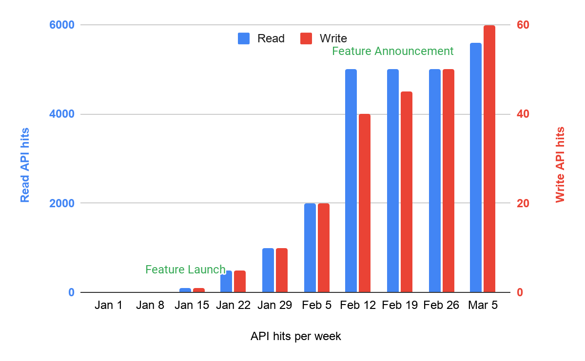
Thanks to the frontend engineers in our BU, I got to use an analytics software to measure the API calls from the frontend of the web portal. The software would show how many times customers opened the web pages (read API calls) and how many times they edited their information (write API calls). The analytics tool we used showed some adoption, but the total number of tickets that continued to trickle in implied that the adoption was not sufficient. I learnt that PMs need to build their metrics dashboards before their launch, not after. You would also want to identify leading indicators, not just lagging metrics.
Examples of software to analyze API calls are Databricks, Microsoft SQL Server, Google CloudQuery, Elastic search, Kibana, Snowflake, Cloudera, Azure Synapse Analytics, Amazon Redshift, and Qubole.
Problem — However, is that adoption high or low?
Another problem — This is a leading indicator and it is moving in the direction we want to signal feature adoption, but is it resulting in changes to the lagging indicator - customer support tickets?
Yet another problem — Is this web portal usage from the same customer segment who created tickets earlier? Or a different segment? Did we change the behavior of a customer segment or encourage another customer segment to also modify their account settings who did not ask for it earlier?
Takeaways
Meeting stakeholder meetings and making process changes are not often in the realm of a Product Manager’s responsibilities (rather Product Operations or Program Management) but you might often find yourself making process changes to meet customer needs better. Using the above examples, you can see the need to anchor internal discussions to the customer benefit - as we did in the roadshow with internal teams. You also saw the importance of understanding the constraints and needs of internal teams - such as when we shut down a customer support channel since it was not aligned with the team’s charter, budget, and capabilities. When making this process change, we aimed for optimum customer experience by redirecting customers to the right channel and upskilling other teams. Lastly, we also realized the importance of due diligence for metrics - identify your metrics and build your dashboards, but also, get them ready before your launch!
Next Up…
In part 3, we will look at how to make customers aware of the new web portal feature and track its success in improving customer experience. We will use some common tools in frontend PMs’ set such as click-tracking as well as leverage hidden insights from answering customer FAQs.


