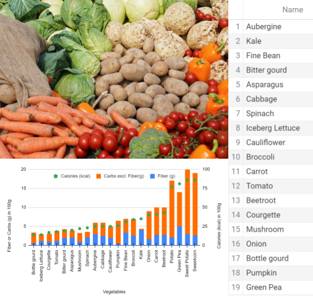
Vegetables. Eat your greens? Applying KPIs to Diet Part 2
Eat your greens? Yes, but not always - There are exceptions to “vegetables are good for you”. Defining metrics, hypothesis testing, and ranking veggies.
In the previous article, we discussed the basics of diet, a sample hypocaloric diet, and inferring the implicit importance of fruits and vegetables. We’ll start unraveling vegetables by looking into the exception vegetables that were recommended to not be eaten when on a diet plan.
Although botany classifies tomatoes as a fruit, I’ll consider it as a vegetable for our discussion.
Why the exception to some vegetables?
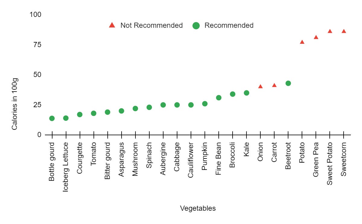
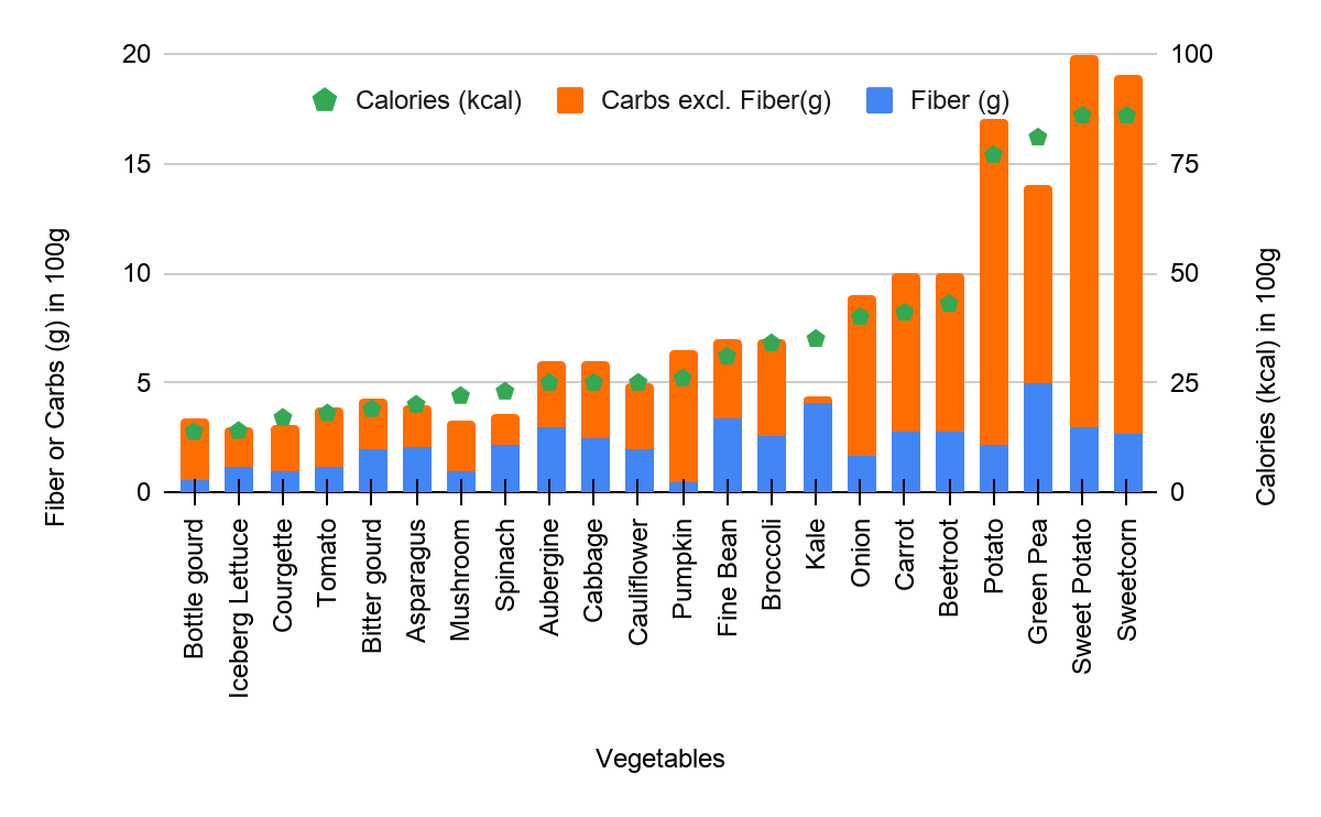
Spot checking the nutrition of the exception vegetables shows that they are significantly high in calories or carbohydrates. If the diet relied on vegetables adding negligible calories, the exception vegetables would mess it up.
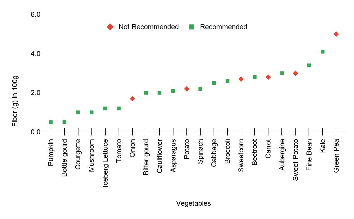
It also seems that carrot and onion need not have been added to the exceptions. Carrot, Onion, Kale, and Beetroot seem significantly close to each other. But calorie density may not be the only reason these vegetables were on the exceptions list. Let’s check their fiber content. I hypothesize that the exceptions, especially carrot and onion, may have very low fiber content vs the recommended vegetables.
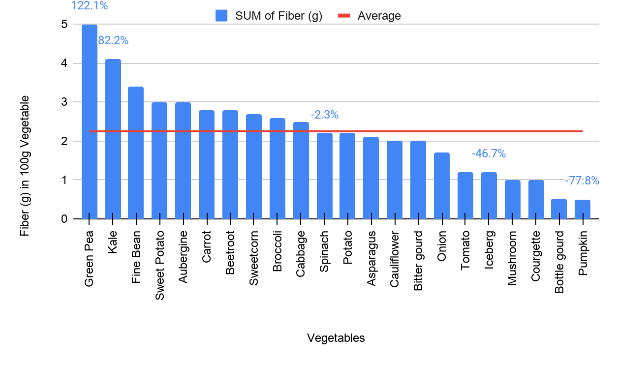
Looking at the above distribution of grams of fiber per 100g of vegetables, it seems the hypothesis was proven false because the fiber in onion, carrot, or the other exception vegetables aren’t distinctly lower than the other vegetables.
Modifying the exceptions list
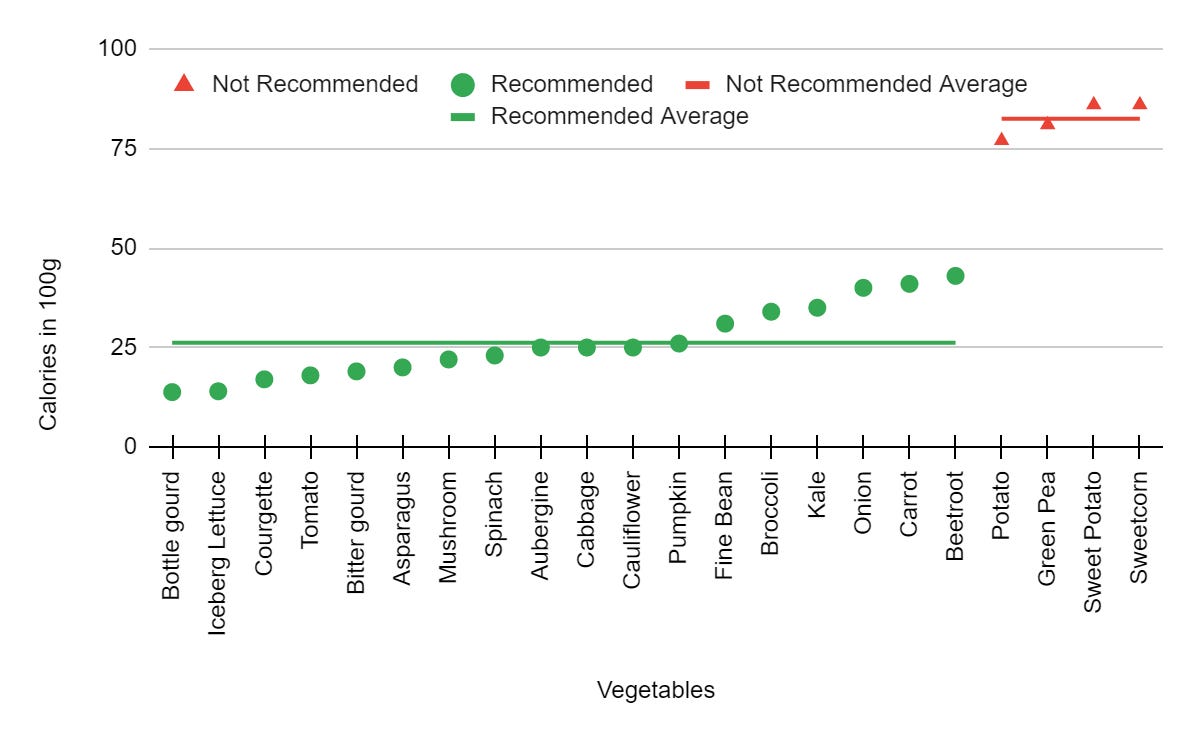
Let’s see if fixing the exceptions list and looking at the distribution helps understand the discrepancy of having an exceptions list.
This graph visualizes that the recommended vegetables average around 25 kcal per 100g whereas the exception vegetables average around 80kcal per 100g. In other words, the exception vegetables are 3.2x times calorie-dense than the recommended vegetables.
We now have one way of ranking vegetables, which is by their calorie density metric. However, consider the recommended vegetable subset - we have around 16 vegetables without metrics to rank amongst them.
Ranking amongst Recommended Vegetables
Three potential metrics valuable for vegetables are:
Amount of Fiber (g in 100g of vegetable)
Amount of Carbs (g in 100g of vegetable)
Amount of Calories (kcal in 100g of vegetable)
We could also have combinations of these metrics such as ratios, as that would normalize the metric. Let’s look at the distribution of all three of these metrics.
The calories and amount of carbs in the vegetable seem to be closely related, which suggests that using one of them is sufficient and we do not need to use both metrics as they are heavily correlated. Let’s see the distribution of fiber content, and don’t mind the “SUM of” artifacts of using pivot tables. After seeing the distribution, I wasn’t sure how much of a difference the fiber content makes, so I have also plotted the average to see how far are the extremes from the average.
This shows that for 300g of vegetables consumed in a day (as per the mentioned diet), one’s fiber intake would range from 15g to 1.5g, which is a significant difference. The way I would interpret this is to not eat vegetables only at the lower end of the spectrum in a week, and mix it up with some vegetables at higher end and some at the lower end each week.
The above visual suggests green peas have a lot of fiber and are a good vegetable for a typical diet. However, we know from earlier visuals that they are high in calories. So, the “goodness” of a vegetable is proportional to the amount of fiber and inversely proportional to the calorie density.
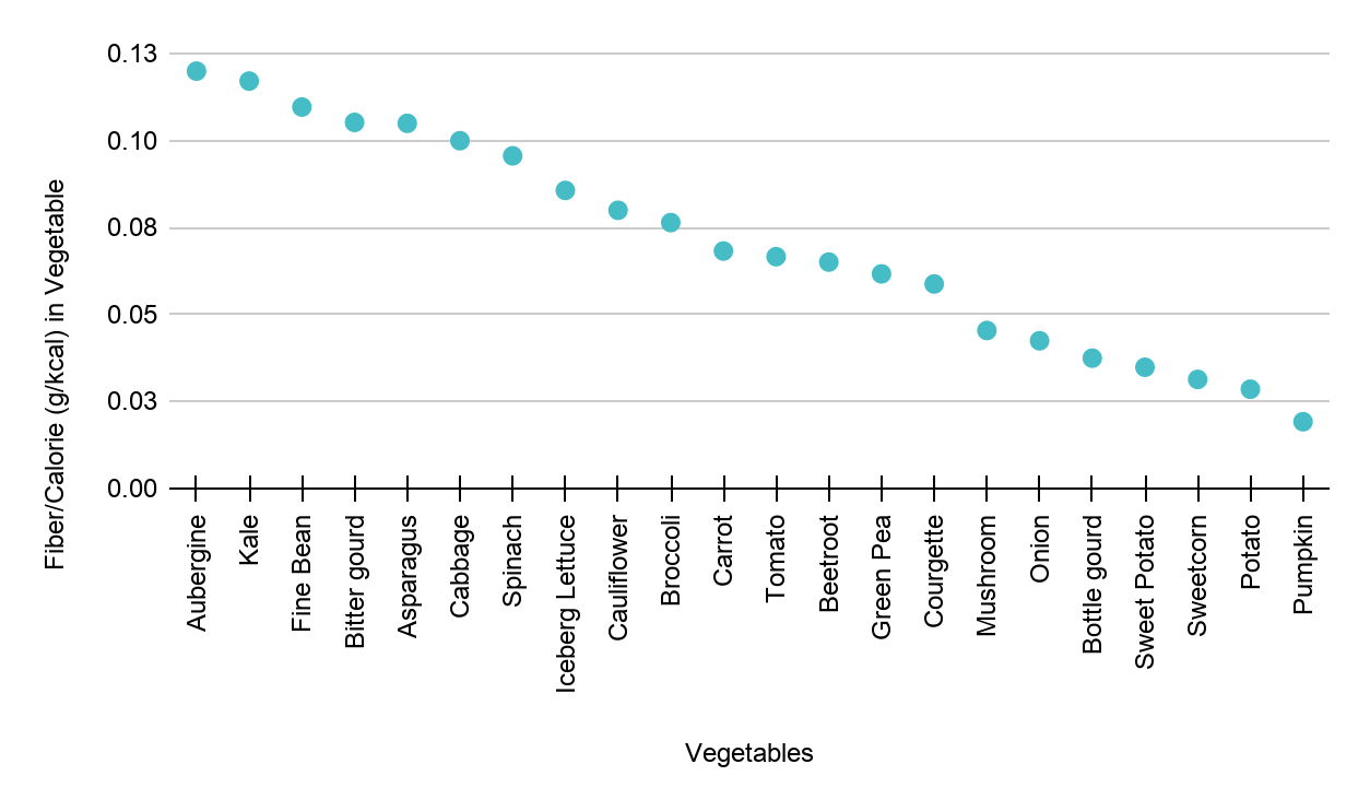
Goodness ∝ (Fiber)/(Calories)
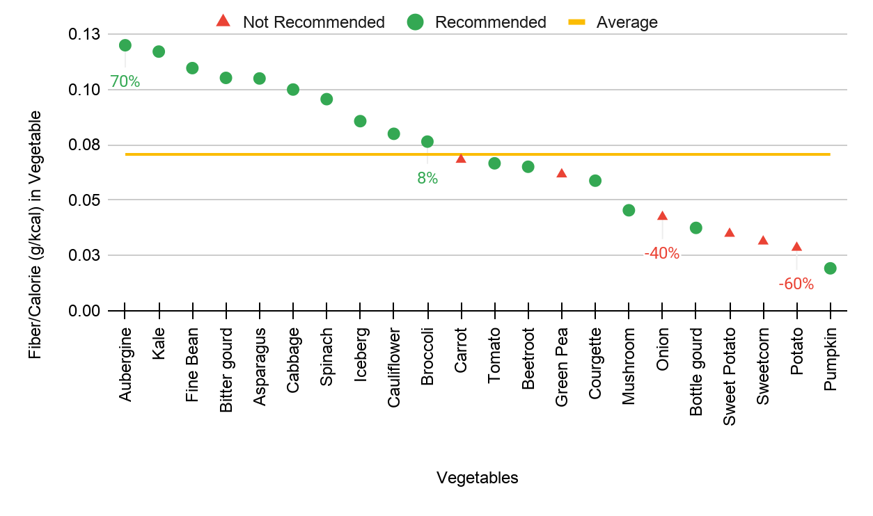
We get the above visual by plotting fiber per calorie across the vegetables. Let’s spot check some of these. The Fiber content in Aubergine, Kale, Fine Bean are all high and they are high on the “goodness” metric. The fiber content in sweet potato is high but it is also high in calories, and it is low on the “goodness” metric. So far so good. Let’s color the recommendation vs non-recommendation vegetables, add average, and add deviation stats from the average.
Combining the metrics we saw for vegetables -
The biggest difference in the distribution was in calories per 100g of vegetable between recommended and not-recommended vegetables. Averages of 80 vs 25kcal/100g, a 3.2x factor.
The distribution of “goodness” reduced some of the extremities of fiber/100g. It varied about +-70% from the average, which is also significant. It also put most of the not-recommended vegetables towards the lower end.
So, ranking vegetables
The conclusion I draw is to rank vegetables first on the calorie density per 100g and recognize the calorie-dense vegetables. It’s good to know that you are adding calories to your day when eating those, and you might want to skip those when on a hypocaloric diet. The second conclusion I draw is that within the calorie-light vegetables, they can be rated based on their fiber content per calorie, which could be used to improve your diet plan incrementally.
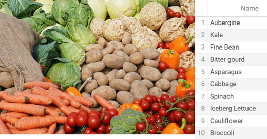
And here is the ranking:
Next Up...
In the next part of this article, we will use nutrition data of fruits to compare and rank them. Quite literally, comparing apples to oranges and ranking fruits against each other. We will need to identify which metrics we want to use and why. We’ll also look at the statistics of fruits vs vegetables - are there any obvious differences?


